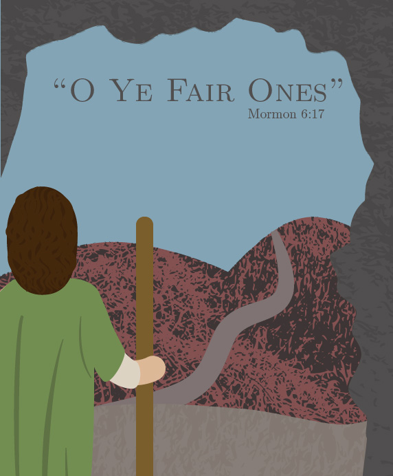
“O Ye Fair Ones”

When we were told to come up with our own project for the final piece, I was told in my Book of Mormon class to do the same. I decided to combine them to do a graphic of a scene from the Book of Mormon. I had a couple scenes in mind, ideas of what I wanted to do, and I was excited to  started sketching to see how they went. We weren’t given any directions or project requirements, it was all left really open. This pushes you to explore new ideas, and think outside the box.

o ye fair ones-final-01

Sketches:

My first Idea was to depict the Savior coming to the temple. I love this scene, but I also felt it was intimidating to try and draw the Savior, even from the back, so I decided against that one. I loved the idea of trying to draw Ammaron when he tells Mormon about the plates, and charges him to remember what happens and keep the record. I think there are a lot of lessons that can be learned, the biggest being that we all have a purpose to fulfill while here on earth. Other scenes I tried include Abish gathering the people trying to share her testimony, A simple illustration of the scripture “Which hope cometh of faith, maketh an anchor to my soul”, a visual for the vision of the tree of life, Mormon overlooking the land of his destroyed people, and Ether hiding in the cavity of a rock.

sketches_final_lharr

Draft:

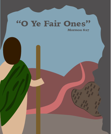
Of all the scenes, I was drawn to the one of Mormon overlooking the destruction of his people. I felt it had a lot of potential, but I didn’t know how to make it happen. I had a really rough draft I did to post to the discussion board, just to see what others thought of it. Still needed lots of revisions, and felt really flat. I didn’t get a lot of feedback from others. The main one was to fix his hand, at least make it rounded instead of a square end. I think this is a good point that will be implemented soon.

draft_final_lharr

Second Draft:

I ran out of time to make all the revisions that I wanted to before turning this project into my Book of Mormon teacher. Based on my roommate’s opinions and suggestions, I added some texture, and tried to make the landscape show the destruction of the scene. The path down the middle is supposed to be a river, but I felt like it was too bright for the rest of the graphic. Also I didn’t like his clothes at all. Despite all this, I think it is an improvement from the first draft, and getting a lot closer to passing for a final project.

o ye fair ones_big-01

Final:

As far as revisions on this version, I continued to work on the river a little bit. The scripture talks about there being so many dead that the river ran with their blood. Hence the red tint to the water. I focused mostly on Mormon this go round. I got some reference pictures from the bible videos the Church puts out, giving me some more ideas about what the back of their clothes would look like.

o ye fair ones-final-01

The title of this project comes from the Book of Mormon scripture, Mormon 6:17. This scripture comes after Mormon has witnessed the destruction of almost all the Nephites, and is morning their loss. He follows it by lamenting: “how could ye have departed from the ways of the Lord! O ye fair ones, how could ye have rejected that Jesus, who stood with open arms to receive you!” I chose this scripture because I think it is a great reminder of the importance of obeying the Lord, and heeding the prophet’s counsel. We have never moved too far away from our Heavenly Father to be accepted back into His loving arms. They are always open to receive any who seeks Him.

The Styl’n Stars Gig Poster

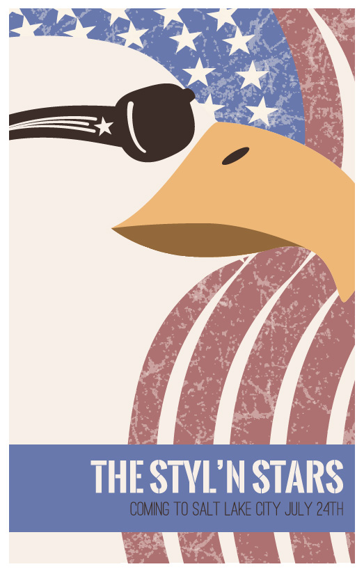
The Styl’n Stars are coming to Salt Lake to celebrate the 24th of July with the rest of Utah. Coming up with a concept seems to be half the struggle (maybe more) in completing projects. For this poster, parameters were again left open. We were to come up with a band name, and a poster that people would want to keep around.

Eagle Poster2-01

Sketches

This project followed an emotional roller coaster in my life, as a result, some of the concepts are happy and bright, and others are sad and depressed. I had a few favorites, specifically the ones in the open hills playing an instrument of some sort, because they reflected the freedom that I wanted, while one of them (the one with the bear playing the violin) also reflected the mood that I was stuck in. In my finial concept idea, I tried to keep the feeling semi neutral, while still having a story that goes with it. Because it was the 4th of July, with the 24th of July (Pioneer Day in Utah that is also usually celebrated with parades, fireworks, flags, and American Pride), I decided to stay with that theme as well.

Gig-Poster-Sketches


First Draft

My first draft was really rough. I had a hard time trying to figure out how to make the flag feel like it was waving, instead of just being static in the background. I tried a few different techniques, but it wasn’t working the way I wanted it to. I finally settled with using the blend tool to repeat the lines, and keeping the same wave in the flag all the way across.

draft_type_lharr


I received some good suggestions on how to improve this design. Some I had thought of, some I hadn’t. The main suggestions were to simplify, and wash the color out so it was more antique looking. I was also told to watch the rule of thirds, and try to utilize it more. Not the entire eagle needs to be shown, and it would make it more interesting if you have to fill in the rest by yourself.


Second Draft

I had a little more time to work on this draft, and I posted it to our class discussion board to see what other improvements I was missing. There are still some things I want to tweak, and there were other elements that were pointed out that I hadn’t thought about. One student suggested I work more on the sunglasses, which I know need work, but they gave me some ideas of what exactly was missing. I was also advised to add a texture, especially to the flag, to add more interest.

StylanStars-01-01

Final Poster:

The Styl’n Stars are ready to perform in Salt Lake! This poster was fun to make, and I learned some new techniques to accomplish the vision I had for this project. Between the second draft and the final design there was a lot of little changes, which although they seem insignificant, they made a difference in the overall look of the piece. I think I was able to capture the majestic, proud attitude of the Eagle, and the freedom of this country.

Eagle Poster2-01


Dance the Night Away

vector_illo_lharr-01

Another assignment has come and gone. This time, the project was to design a t-shirt. The parameters were left pretty open, allowing us to explore different concepts and have fun picking a subject. I love swing dancing, and almost immediately knew I wanted to design something related to swing. Swing dance is very peppy, happy and fun, so I wanted to incorporate that aspect into my design as well.

Sketches

I started sketching with a few directions in mind, but mostly leaning toward trying to capture some of my favorite moves. I looked up images to base my design with, and went with it. I also wanted to have a catchy phrase to go along with the image. The combination of these would create my t-shirt.

shirt_sketches_lharr

I was happy about how various aspects of these sketches worked out. I thought they caught the desired moves fairly well. I tried to change the moves up between dances, some coming from Lindy Hop, some from Charleston, and others are different types of dips common to swing. Design wise, I wanted to stick with silhouettes of the dancers, but I also liked the hide and seek idea with some of the sketches above. I also tried to incorporate music notes into some of the options, but they didn’t feel like they fit. I figured tweaking could happen in the next stage.

First Draft

draft_illo_lharr

My first draft was very rough. I picked the slogan “It Don’t Mean a Thing If it Ain’t Got that Swing” to go along with a famous song about swing dancing. the move that is portrayed is a basic swing out in LindyHop. However, although it may be the basic, it can lead to countless options depending on your skill level in the dance. I liked the idea here, but I knew I still had a long ways to go before this would be finished.

In showing this design, and my sketches to others I was able to gain some feedback and suggestions that were helpful. It was pointed out that I was balancing between a realistic design, and a more illustrative look, which doesn’t work. The girl in this illustration has a bun, that made her look older, and had just a bump on her head. Some wanted a more complex and dynamic move to be portrayed, others liked the simple move. Most of all, I was told to stretch to bring the excitement of swing dancing into the design.

Some other drafts I played with include:

draft_illo_lharr2-02

draft_illo_lharr2-03

These were good starts for different directions. With the top one I was still trying to do silhouettes. I think the move is portrayed pretty well, but it was still missing the excitement of Swing dancing. Another suggestion I had received was to use shapes to form my illustration. I decided to try something a little different, and went with the stars. This started to add a little more to the design, and so I went with it.

Final Product

vector_illo_lharr-01

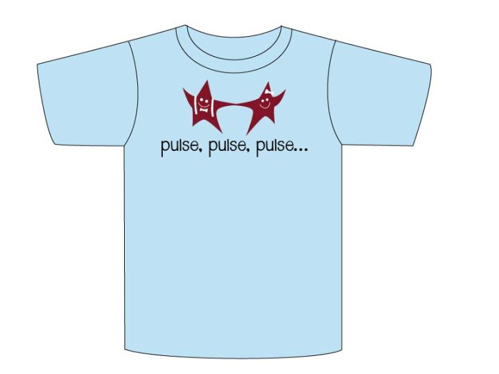
In my final design I combined color, shapes, and concept to create a fun t-shirt about dancing. The stars add an additional element that brings the fun feeling of swing dancing, while the accessories help clarify the style of dance as well. The colors make the design pop, as opposed to the dull, flat feeling of black and white. Overall, I think it captures the excitement I get when dancing.

Vector Beach Cruiser

final_bike_lharr

Who knew that there is so much detail in a bike? For this project we were given the assignment to create a vector bike of some sort. This bike could be anything that had 2 wheels, which left it open for possibilities.

My first thoughts on the project were to do a mountain or road bike, since that is what I usually ride. However, I was looking for reference material, and really liked the cutesy feel of a beach cruiser. When I think of beach cruisers I think of sunshine, warm weather, and beaches (of course!), and I wanted to try and capture that feeling in my design.

Sketches

As I sketched I did break away a little trying out a unicycle, which I didn’t dwell too long on because it only has one wheel, some kids bikes, and some road bikes. Some were easier to draw than others, and I learned, again, that I have a hard time free-handing perfect circles. In the end I kept coming back to the cruiser, so that’s what I stuck with.

sketches

After doing some sketching, and looking to see what I could improve and how I could best implement the design on the computer, I went to work. My first draft is a little rough, but I think it has most of the essential elements to a bike present. Handlebars are a challenge, and hard to keep in perspective. I also learned some things about the pattern brushes for the bike chain, which proved useful. There are a couple of elements I struggled with here, but the basic outline is there.

Drafts

draft_bike_lharr

I continued to work, trying to improve the little inconsistences, especially related to the handlebars, and adding a little shadow to define the shape. I wanted to stay with the illustrated feel while still adding detail, so I opted not to use gradients in this project. I also worked on the spokes, and the way things attach to the bike. Overall I think this is pretty close.

draft2_bike_lharr

When I finished this draft, I noticed there were still some issues on the seat that needed adjusting, and the bike looked a little like I had copied it from one of my reference photos, even though there were a lot of differences, the overall feel was similar. I decided changing the color might help, and I made sure that I was taking elements from other reference photos as well. This version also adds details like the seatpost clamp to adjust the seat height, and the attachment for the handlebars to the bike frame.

Final Bike

final_bike_lharr

Overall I think I was able to keep the illustrated feel I wanted, I had wanted to incorporate some of the emotions and images that come from beach cruisers, which the bright colors bring out, and I was able to incorporate a lot of the needed details without cluttering the design.

Designing a Timepiece

For this project, we were challenged to create a detailed timepiece, which I decided to turn into a watch. At first, because we could do anything, I was looking at pocket watches, but decided that it would be really cool to have a watch that I drew/designed. In my research I ended up finding a couple of watches that I really liked, which I used as examples and inspiration for my design process.

Sketches

After researching my topic, the next step is always to do some sketches to know what kind of look I want to portray. I use the research as examples to find the aspects that I liked, and don’t like about the  object. Sketching allows a fairly quick way to get ideas out in the open, to reference later.

sketches_timepiece_lharr

Drafts

The next step in the design process is to turn the sketch into a vector draft. I liked the 2nd to last sketch, and decided to stick with that type for my final project. I used two pictures as reference, and got to work.

bluewatch colorwatch

I really liked the face and color of the blue watch, but I liked the more sporty feel of the bottom watches. So I decided to combine them. At first the hard part was just trying to get the different shapes to match up so it doesn’t have awkward spaces between shapes. My first draft looked like this:

draft_timepiece_lharr

I thought it was pretty good. I thought that it was coming along nicely, and didn’t think there was much to change. Until I went to class, and learned some more tricks that our teacher showed to make this look more realistic. I have always had a hard time with lighting and shadows, and usually leave it alone, but Brother Kerr, our teacher, is trying to get us out of our comfort zone, and to try new, exciting things now, instead of waiting until I feel like I am good enough.

Final Project

Here is the finial watch looks like this:

final_timepiece_lharr

I am still working on trying to figure out light and shadow, but I think I did a better job with this project then I have with others so far. It is a learning curve and this is a great place to start to learn more. I have learned that the more you try to do something, and take the time to look it up, the better you will become at that particular thing. This goes for anything, but especially learning new skills. This is a great place to learn more about some new skills that will be helpful in using Illustrator through my designs down the road.

Creative Combination Logos

Final3

What makes a good logo? How can you creatively combine two completely different ideas, and make them work together? There are so many different businesses out there, and so many different logos. Some work well, anad some don’t, but what makes the difference?  How do you make yours stand out? This was our task for this project.

Every student was given 3 different businesses, each a combination of a random noun, and a random business idea. The task? Combine them in such a way that both subjects are easily recognized, without just putting one object on top of another. Find a way to integrate the two together. However, this project was not just about learning how to create a logo, but about the creative process that gets us there.

Sketches:

Three business, six concepts, and two weeks to finish. Where do you start? What is the best way to combine these ideas? This stage is all about exploring your options. The 3 businesses that I drew to create combination logos for were Hedgehogs and Records, Heels and Bank, and Kangaroo and Food Eatery. The last project was then later replaced with Jedi and Mall.  This wasn’t the hardest set of logos ever, but not the easiest either. As you can see, I did a good amount of sketching.  I would usually try and sketch in a more profession place, but there are some times that when inspiration strikes, or you have a few minutes to try, you will take whatever you can get.

As I sketched these, I had some that I thought were good, and some that were possibly the worst ideas on the planet, but at this stage, it is important to get all the ideas out on paper then after a certain amount of time, work on developing these ideas into reality. Part of my problem is I tend to want to work on solving a problem until it is completed, and that led to quite a few long days throughout this process. I find that it is so easy to get preoccupied with homework that I don’t take any time for myself, and then I get burned out. I have found that a lifesaver for me is playing on a basketball team, which gives me a scheduled break from school. After getting that break it was easier to come back and get a fresh start. This allows for time to think without being solely focused on this project. Leave it alone for a little while, and take some time to break up your routine a little bit. Then, as you come back to your project, inspiration will strike.

Hedge Hogs 1 Hedge Hogs 2 Hedgehog 3 Heels 1 Heels 2 Heels class Jedi 1 Jedi 3 Jedi 4 Random Sketch

Next comes my favorite part. Converting your sketches onto the computer… I like this part because although I know that sketching is important, I don’t feel like I am good enough at it to express my ideas, where I think I come closer as I start doing it on the computer. I think a big part of the digital variations is deciding on how many to save. At how many different stages do you save a project? In this process, I learned to save regularly, because you never know what ideas you will revisit in the future. For example, my hedgehog Records, I had a few different versions. The one that I ended with was one that I though I was just doing for my homework, and not really something I was going to use, so I almost didn’t save it fully. It is a good idea to save it regularly so you can refer back to your previous ideas. You never know where you will find the inspiration that will really work.

Another reason that I like the digital variations is because it doesn’t take much. We talked about how many different files to save, and again, I would still save a good portion. However, you must figure out your direction, at least in a general sense before any of this stage makes sense.

Hedgehog Draft 1  Heels Bank Draft 1Jedi Mall Draft 1

By this point I was getting a little tired of looking at my logos,. Not that I didn’t think they were good ideas, I just didn’t want to have to work on it any more. However, I think this exercise was also really helpful. It gave me a chance to look at that the different fonts, and to the message that they send out. Based on that message, it will help you decide what is going to work for you. What is going to portray the message that you want your customers to see. That message doesn’t really come just  by the content of the type, but also mostly about how you use the font that you choose to its best ability. I thought it was interesting that although I have a few favorites, they aren’t really the ones that will  work well for this project, much as I try. For example, the “Heels bank” idea had lots of different fonts attached to it looking for the professional feel of a bank. Who knew that would be so hard?

I learned again that it takes work to mesh the two elements together. I have often heard professors or professionals say that the main problem junior designers have is they don’t match the design with the type. It looks like it is just pasted on top of each other. I hope that I was able to integrate the two together, however, I still have a lot to learn.

Heels Bank type experment Hedgehog type experment Jedi type experment

Final-3

Is a project ever finished? Something that I tend to do, is fuss over the little things. I think that is part of why I spent so much time trying to get the Logos to look good. But at the same time, I often keep fussing until it gets almost to much. I think there also has to be a point where you cut it off and say that you have to be done. For example, this last weekend, usually I would have worked on this project all weekend, but instead, I went to SLC where they were holding a start-up business conference that my mom and brother said I should come to.  That meant that I didn’t have all weekend to work on my logos, and had to be ready on Friday when I left. I might still change them a little before getting them presented, but for the most part, they just had to be done, and that is ok. In the end, all that matters is that you do your best.

As I got to creating the final project, I started asking some of my friends what they saw in the symbol, and what they would change to make it more recognizable. This helped me wee what others thought of it, instead of my own bias. It was interesting to see what people came up with, and I hope that I was able to implement their ideas to make them as recognizable as possible.

Final3

What have I learned in this process? I learned to keep pushing myself. Keep looking for ways that you can improve your ideas. Be willing to change. Don’t become so attached to your ideas that you can’t admit that it’s not working on change it to something that will. I learned to get more feedback from the beginning. Don’t be afraid of sharing what you have with other people, because they will have a fresh view on the situation, and most will offer suggestions when asked.

I learned to trust that I could come up with ideas. To often I think that I’m no where near good enough, and that the ideas I have for my own project aren’t even close, which isn’t really that good.

I mentioned that I went to that seminar this last weekend. One of the gentlemen that shared his story, said to give yourself a certain amount of time, and write down as many ideas as you can. Then start weeding out, and picking the best ones. But he went through more than 60 business ideas before he came down decide on one. I sketched more for this project, past the requirement. I think I have received valuable ideas through listening to other’s advice. My job in the creative field is to make those ideas become a reality. We have a process to help those ideas become real, and this class as a whole is to find how that development process works for me.

Summer Icon Set

vector_icons_lharr

The task I was given was to create a 12-icon set. This sounds pretty easy and straightforward. I didn’t get any directions on what the icons were for and I wasn’t given a subject. This allowed me to explore a lot of different options.

By nature, icons are simple, relating an idea with as little detail as possible.

 Word Lists

I found that the wide-open range allowed for too many options. There are so many different topics, and even when narrowing that range down to my hobbies and interests, it was still too open. I enjoy a lot of things: swing dancing, horses, nature, camping, hiking, biking, swimming, reading, computers, animals, picnics, summer, spring, flower, and the list goes on. Because there were so many directions I could go, I decided to start with some word lists to see what topics I could come up with 12 different objects I could turn into Icons.

Wordlist

The next step was to start sketching. I picked three topics, and started to sketch. These sketches were scattered all over my class notes, a sketchbook, and any scrap paper that I had around. I find that inspiration hits at random times, and there is no controlling it. Because of this, a lot of my sketches are small and rough with the exception of my sketches for the bike parts which I sat down and tried to get something that I liked. However, after finished that set of sketches, I didn’t like them because of how detailed they had become.

Bike-Sketches-1 Bike-Sketches-2 Bike-Sketches-3 Summer-Sketchesbike-and-hike-iconsketchescupcake-sketchessunglass-and-lemonade-sketches

It came time to make digital versions of my sketches, and I still hadn’t decided over a theme. After looking over my sketches, I decided to go with the summer theme. I originally chose theme because they were simple shapes. Or so I thought. As I have tried to implement other ways of creating work, I decided to try and use mostly the Shape tool and the Shape builder to create my icons as opposed to my usually default to the pen tool. This would give more of a geometric feel, and create cleaner edges. It wasn’t as easy as I thought it would be. I got the first draft of 6 icons completed, and was stuck. Although I thought they looked ok, I wasn’t sure what to do next, and I was still trying to find a style to unite the icons into one group.

draft_icons_lharr

I continued to work on this project, and decided on a few constraints that would untie the group. These included: the use of green in every icon, using only the colors in a regular food coloring pack and a neutral color, having a 1 pt stroke on everything, and they were all either tilted or had some element tilted to a certain angle. I added the color, played with the placement and order of the icons for a long time trying to get the colors to work out, and have the whole set balanced, and posted it for review by my classmates.

draft_icons2

The only feedback I got was to take off the stroke and define the shapes with fill and value. This took out one of my restrictions, and created a new one. So I worked with that for my next draft. It was a little more difficult because I was using the stroke to define my shapes more than I should have, and I had some icons that were white on the outside, which doesn’t work without the stroke. After making some changes to allow the icons to be easily recognizable, I finished my next draft with these.

vector_icons_lharr

This is good, but not great. Although I tried to get the shapes to define themselves while keeping my previous restraints, it didn’t work as good as I had hoped. So I reworked them adding some other unifying factors. For example, all of my final icons have a green outside stroke, with no stroke on the inside. I also tried to use different values of the same color to define the shape more and help them be more 3 dimensional. My final icons turned out better than the previous drafts, and I think they are a cute collection of summer items.

vector_icons_lharr

Through working on this project I learned how to use new tools in Adobe Illustrator, how to create simple icons with the same style for a united feel, and that it is important to pay attention to detail. It isn’t always easy to get graphics exactly how you want them, but it is possible.. Adobe Illustrator is a powerful program that has many different uses. I am excited to have learned yet another set of tools for future use.

Visual Alphabet

Our world is surrounded with objects, and we interact with them constantly. It may be a Cell Phone, or a pair of shoes, or maybe even a random assortment of collectables. Whatever it may be, there is always more that object than what we may see at first glance. For this project, we were to create a visual alphabet out of a object of some sort.

This project gave us the opportunity to design with more than just the tools on our computers. Using a camera, some sort of object, and our creativity, we were to create a story as we displayed the alphabet. For this project, my object was orange peels. Something that more than just having different shapes, has many uses as well. It was fun to have to find different ways to peel the orange in order to get different shapes.

Final-Alphabet

Sketches:

Find the alphabet, don’t have obvious solutions, and then try to draw it! That was the challenge displayed here.  There are a lot of different objects that all of us have lying around, some of which us useful, others aren’t. Some of them offer natural constraints that might be harder to work around, and others you have to create your own constraints. These are just a few observations that I had as I was trying to draw sketches.  There were a few ideas that while still in the thinking stage I thought would be great, until I tried to draw them and realized that I had no idea how that would work. Even the objects that I could make attempts to maneuver and then draw, I found that it was even harder than I thought it would be to make all the letters.

With that being said, it’s still very important to include these sketches in our work. As the saying goes “Proper Prior Preparedness Prevents Poor Performance.”  That preparedness can come in many different ways. Because we had a couple of days to work on it, the first while I just added a list on my phone of what I could possibly use. It’s amazing how ideas come at the most random times. While running, or in the middle of Music class, and in many other different places.  Usually it’s only when we are prepared and ready for inspiration that it comes. With that being said,  the more ideas you have, the more options that you have, and the more good solutions you have to choose from.

Alphabet Thumbnails pg1 1

Alphabet Thumbnails pg2

Visual Experiments:

It’s always a little interesting to try and change your sketches to actual forms. Often times I think we find that either the object doesn’t move the way we were thinking, or the proportions are wrong. I think that’s why it is important to try a couple of different options before choosing or getting your heart set on one option. To often we get stuck in what we know, or what we have pictured in our mind that we miss the different solutions placed before us.

As I was experimenting with a couple of different solutions, I found that more times than not, what I had sketched was not what I could create from just that object. That is when – as well as many other times – that group work becomes important. When we use the synergy that multiple perspectives can bring, new ideas. Its also important to remember that we can’t find the right solution until we try many wrong ones. Thomas Edison didn’t fail a thousand ways to make a light bulb. He just found a thousands ways that didn’t work. There is a big difference. One that when we learn, will bring many differences to the way that we work.

visual-experiments

First Draft:

I feel that I need to include some notes here as well. I really like this design, perhaps better than the final product. There were some conscious decisions that I made with this design that others didn’t agree with. To start off with was the white background. Black probably would have set it off better, but I found that I didn’t like that idea very much. When I think of oranges, I think of breakfast, and morning time. Even if it is dark outside when I get up, I still don’t want something dark to start my day off. I think the white background gives it a feeling of a bright, sunny day.

The other thing that I liked was the contrast of both size and color. For me, when I thought of peeling an orange, and the story behind that. Not all oranges peel the same way, and not all pieces of the peel fall to the table the same way. They are almost never the same size, and often they don’t fall in a neat line. I also thought it was more visually interesting to have the variety built in. However these were things that were shot down almost immediately, and I was told to fix, and so my final ended up being a little more organized, and in my opinion less interesting. However this is another lesson for the real world, because I would bet as designers, there are times that a client has in their mind exactly what they want, and sometimes aren’t willing to let that change, and so we create what they want and expect. Even when it may not exactly be what you think will work the best.

Layout-1

Letter Variations:

All the steps in the developing process are very important, but I think that this is one of the most important steps. I know for me, once I decide on an idea to follow, I start planning in my head what it is going to be, and often I get stuck there. I can’t seem to find other ways to do the same thing multiple different ways. However, this step forces you to explore other ideas. It helps me see that there are more than one way to do things, and sometimes your first ideas aren’t your best work. I always find that as I push myself to find more ways to accomplish my goal, it gets easier to find new perspectives.

Now with Orange peels, finding variations proved to be fairly simple, even though some letters turned out to be really hard to peel and not have it break in the middle. At first I was only going to use the outside part of the peel, but as I was laying them out, I found that the insides were interesting as well, and created a little bit of contrast and variety to what I had wanted to do with it.

variations

variations2

Final:

This turned out to be harder than I thought it would after doing all the earlier work. I found that as I started to cut out the shapes, that I had to cut out the shadows differently so I could help them be not quite as strong, and feel more real. I also found that I never had as many variations of each letter as I thought I had. I found myself still taking pictures, and needing more variations because the ones I had just weren’t working. Sometimes it was the wrong side of the orange peel, sometimes it was to big, and other times I just didn’t like the options that I had to work with. By the end of my picture taking, I had a quart sized Ziplock bag completely full of orange peels and my roommates don’t want to see another orange for a long time. I did learn though, in that process that orange peels stay good a long time when you put them in a bag. I was quite impressed.

As I was in Photoshop trying to cut everything out, part of my learning curve was to remember how to use the tools that we are given. Having recently returned from a LDS Mission, I haven’t used these programs for a couple of years, so it was fun to figure them out again. I also learned how important it is to save your progress every step of the way. It makes things easier when you come back and have to change something, if you have saved your selection, or you haven’t flattened the psd file yet, the information is still there so you don’t have to recreate it all.

Final-Alphabet

I think one of the biggest things that I learned was that I could do this. Having just gotten back, and being a little out of practice; I have been a little scared to take this class. However, as I have been working on these projects, trying to get everything right, I have found that it’s not as hard as I was anticipating. I think that is the biggest thing I could have learned, giving me confidence to move forward, and realize that yes, it is a lot of work, but it will help me become a better designer, and better able to accomplish things that I will come across as I get into the industry.
Extra Photobook Pictures


Past Photos:

Image

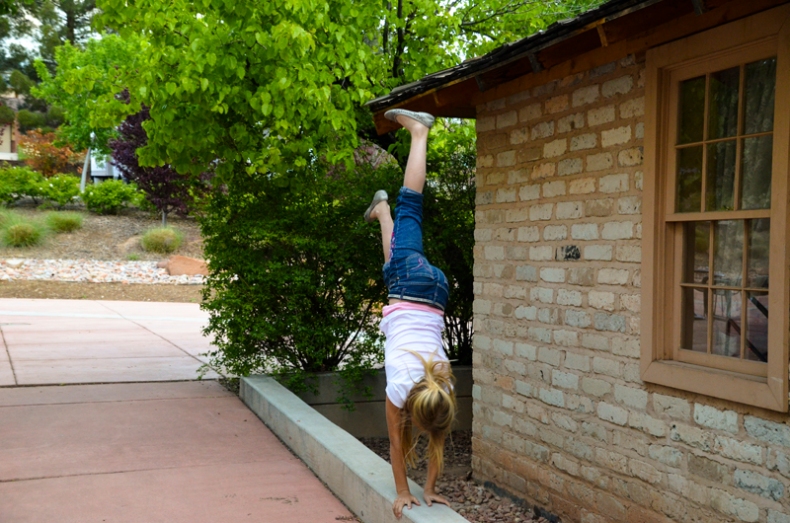
Brin Handstands; 4/11/12, 7:57:36 AM; St. George Utah, f/4.2; 1/500; NIKON D5100;

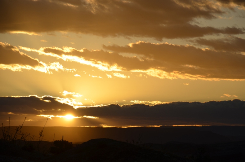
ImageSunrise in St. George; 4/11/12, 7:17:38 AM; St. George Utah, f/10.0; 1/800; NIKON D5100;

Image

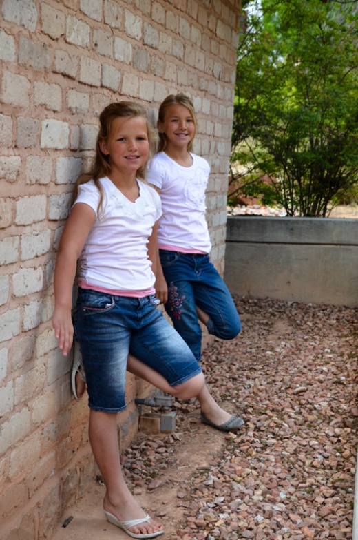
Sisters in White; 4/11/12, 8:20:52 AM; St. George Utah, f/5.0; 1/160; NIKON D5100;

Image

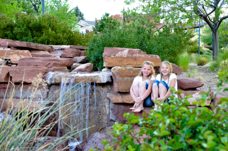
Sisters at the Waterfall; 4/11/12, 7:48:32 AM; St. George Utah, f/7.1; 1/60; NIKON D5100;

Image

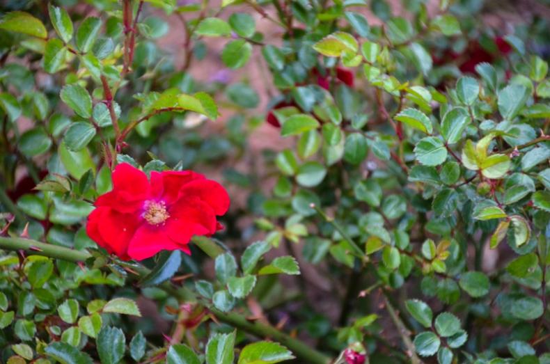
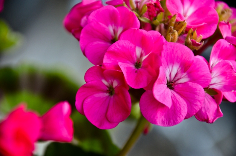
Red Rose; 4/11/12, 8:01:08 AM; St. George Utah, f/6.3; 1/125; NIKON D5100;

Image

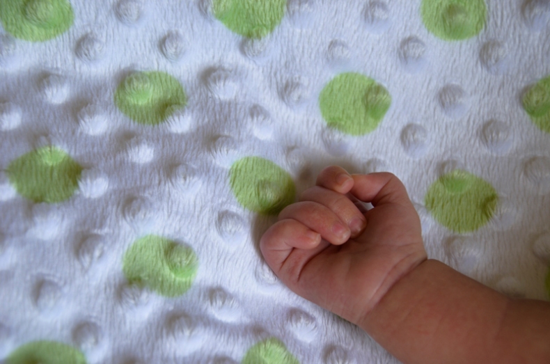
Baby Hand; 4/11/12, 3:13:54 PM; St. George Utah, f/5.6; 1/125; NIKON D5100;


Color Study:

Image

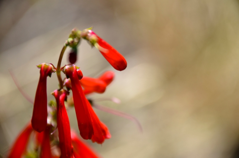
Red Flowers; 5/28/12, 10:26:34 AM; St. George, Utah; f/8.0; 1/320; NIKON D5100;

Image

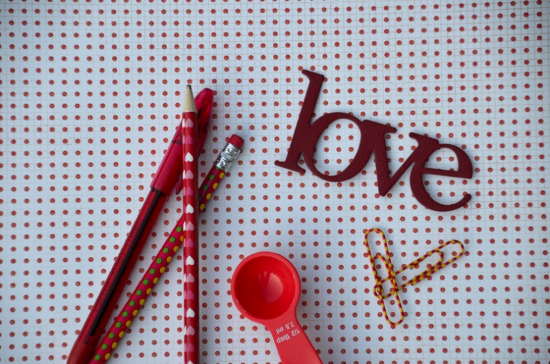
Random Red; 6/25/12, 6:35:27 AM; Rexburg, Id; f/6.0; 1/125; NIKON D5100


Floral:

Image

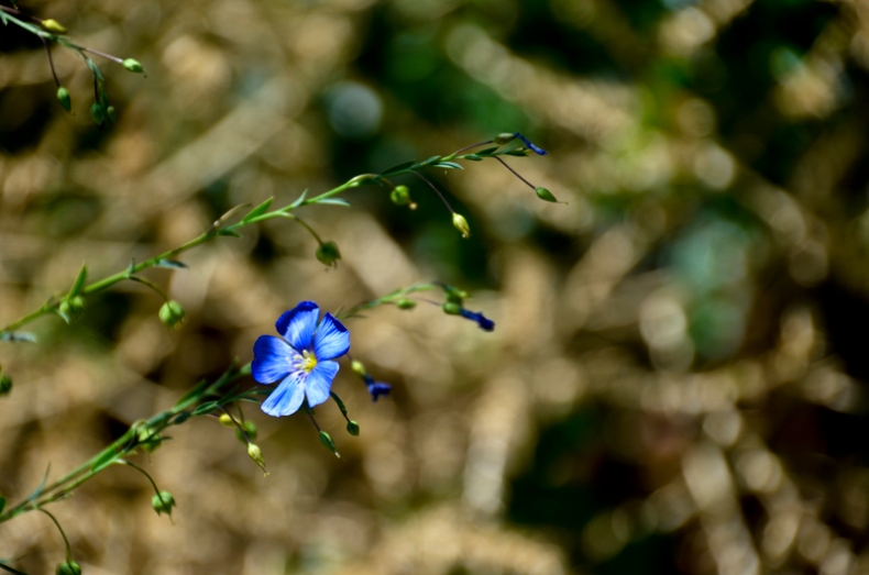
Blue Wildflower; 5/28/12, 10:25:34 AM; Draper, Utah; f/8.0; 1/250; NIKON D5100;

Image

Pink Hydrangea; 6/25/12, 6:45:33 AM; Rexburg, Id; f/6.0; 1/125; NIKON D5100

Image

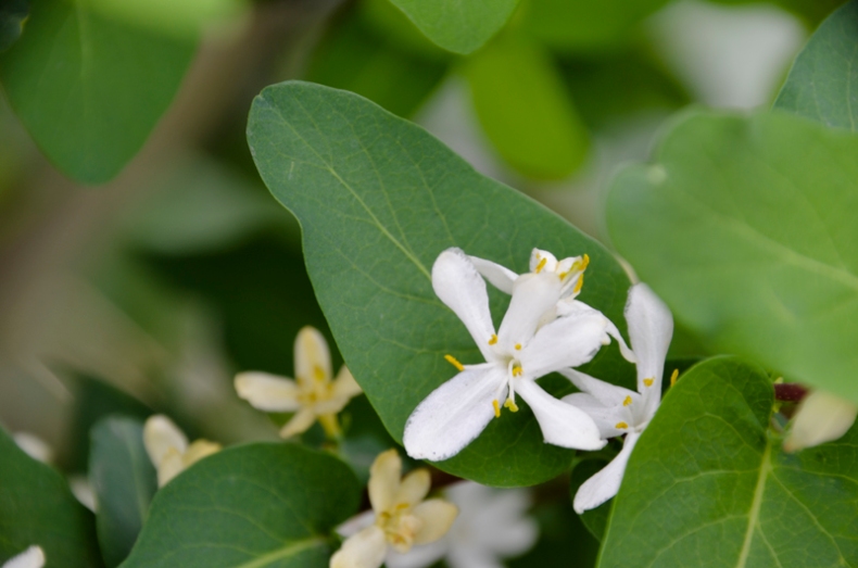
White Flower; 5/5/12, 5:07:58 PM; Rexburg, Id; f/11.0; 1/30;  NIKON D5100

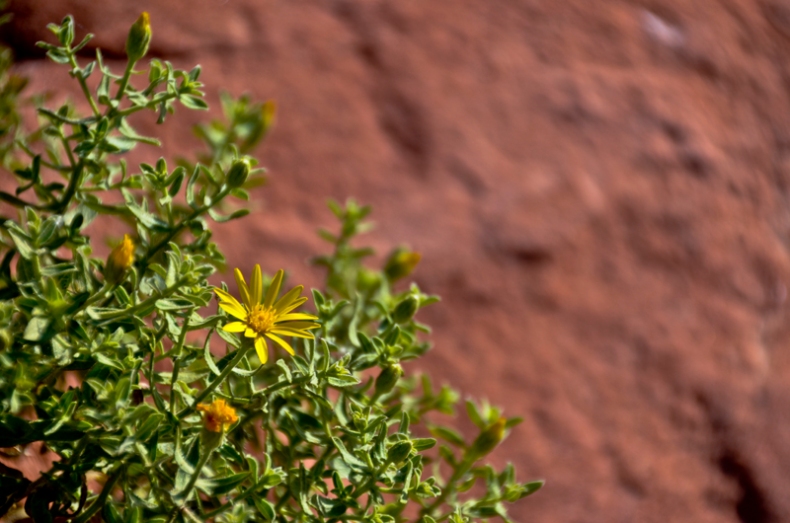
ImageYellow Flowers and Red Cliffs; 5/19/12, 8:47:17 AM; St. George, Utah; f/8.0; 1/320;  NIKON D5100


Portraits:

Image

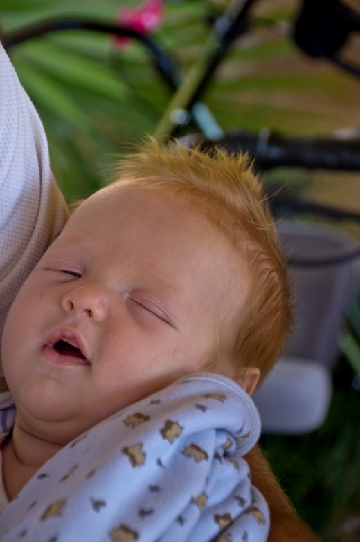
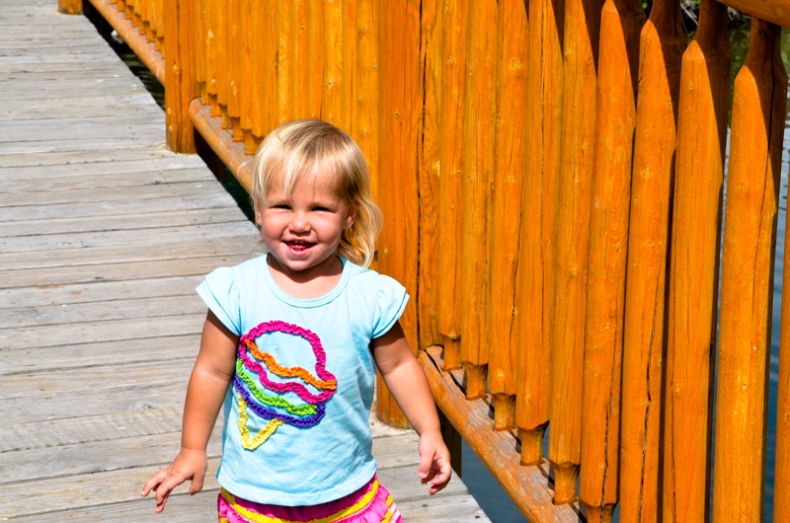
Baby Steven; 5/19/12, 2:57:09 PM; St. George, Ut; f/6.0; 1/60; NIKON D5100

Image

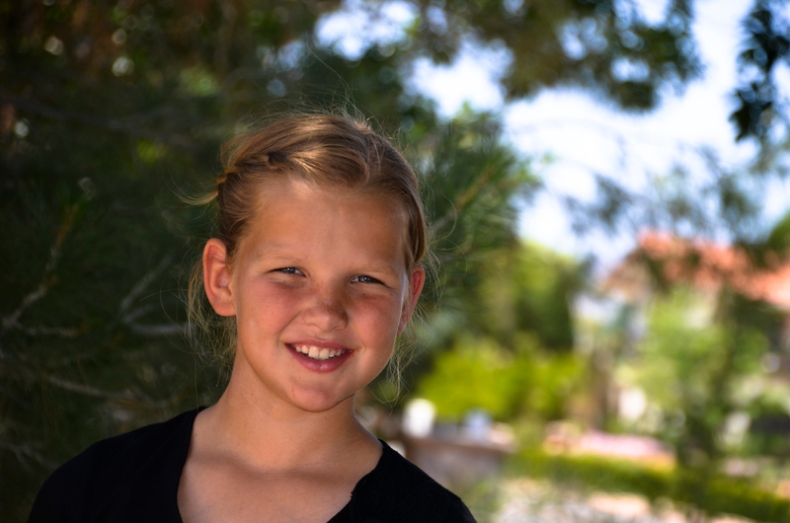
Sara; 5/20/12, 1:49:08 PM; St. George, Ut; f/6.0; 1/200; NIKON D5100

Image

Sophia!; 6/21/12, 2:53:04 PM; Rexburg, Id; f/10.0; 1/400; NIKON D5100


Bannack Best:

Image

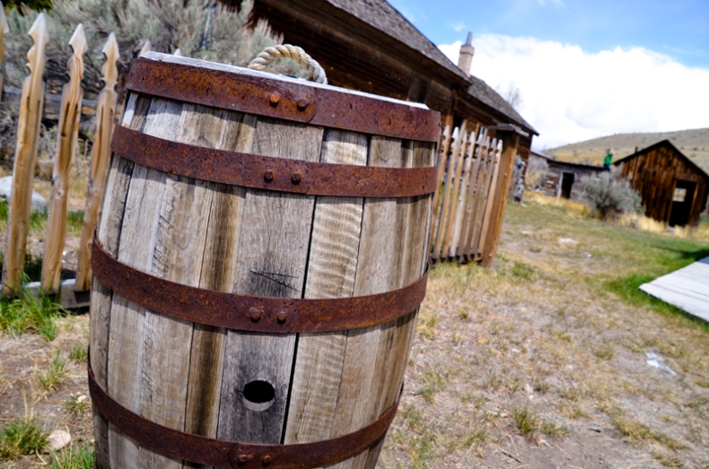
Barrel; 5/24/12, 12:28:58 PM; Bannack Ghost Town; f/8.0; 1/250; NIKON D5100

Image

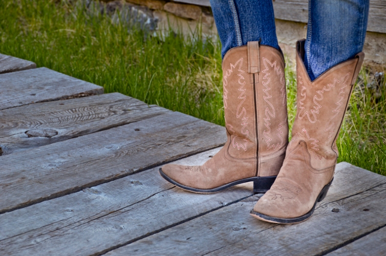
Boots; 5/24/12, 12:54:06 PM; Bannack Ghost Town; f/5.6; 1/250; NIKON D5100

Image

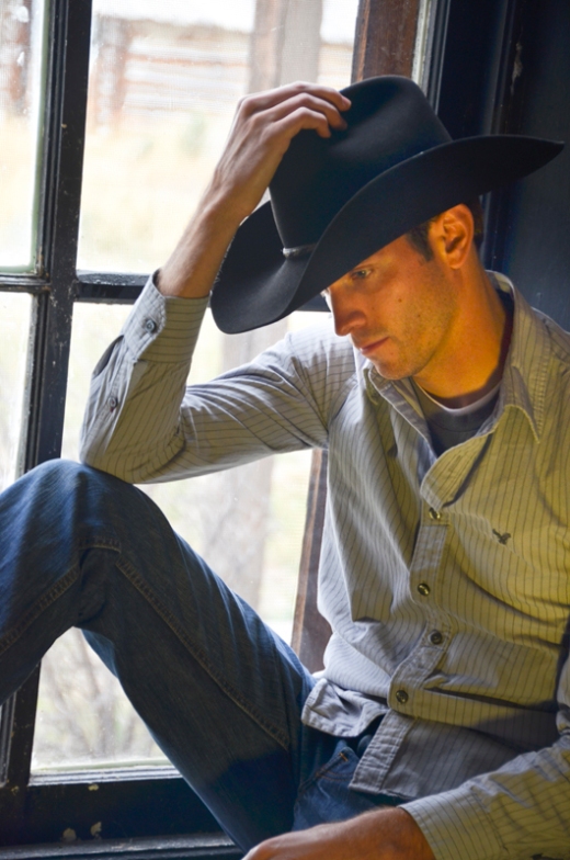
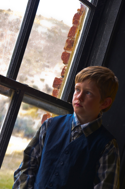
Jett; 5/24/12, 2:16:37 PM; Bannack Ghost Town; f/5.6; 1/200; NIKON D5100

Image

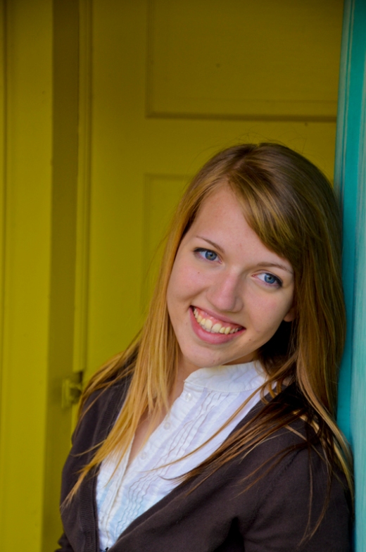
Kris; 5/24/12, 3:52:52 PM; Bannack Ghost Town; f/6.0; 1/50; NIKON D5100

Image

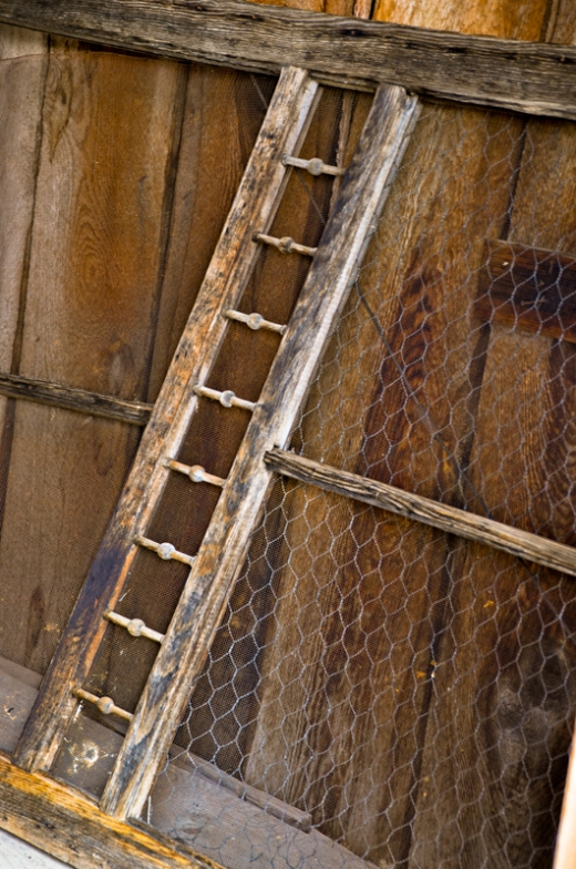
Ladder; 5/24/12, 4:21:48 PM; Bannack Ghost Town; f/5.6; 1/13; NIKON D5100

Image

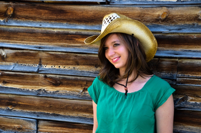
Mindy; 5/24/12, 12:52:49 PM; Bannack Ghost Town; f/5.6; 1/250; NIKON D5100

Image

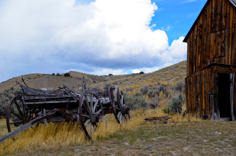
Old Wagon; 5/24/12, 11:56:51 AM; Bannack Ghost Town; f/7.1; 1/1600; NIKON D5100

Image

Troy; 5/24/12, 3:08:30 PM; Bannack Ghost Town; f/5.6; 1/80; NIKON D5100

Image

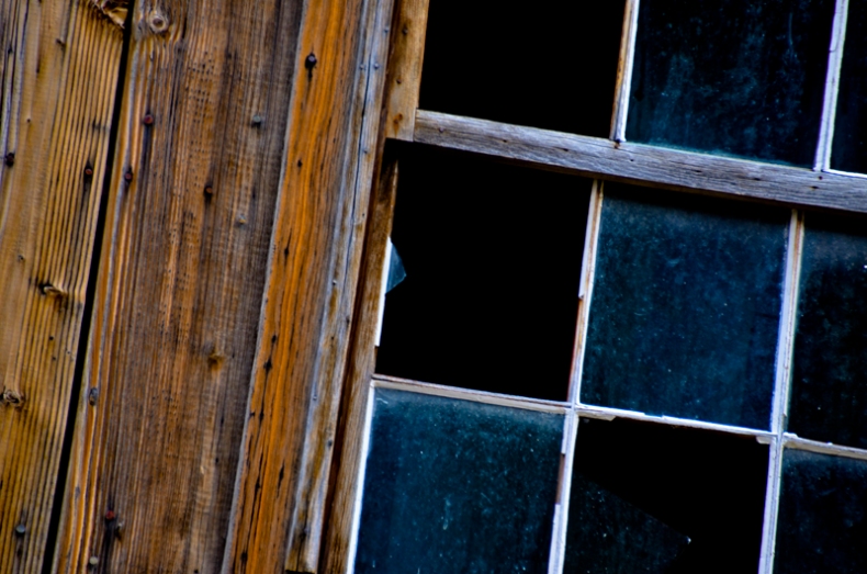
Window; 5/24/12, 5:32:33 PM; Bannack Ghost Town; f/6.3; 1/40; NIKON D5100


HDR:

Image

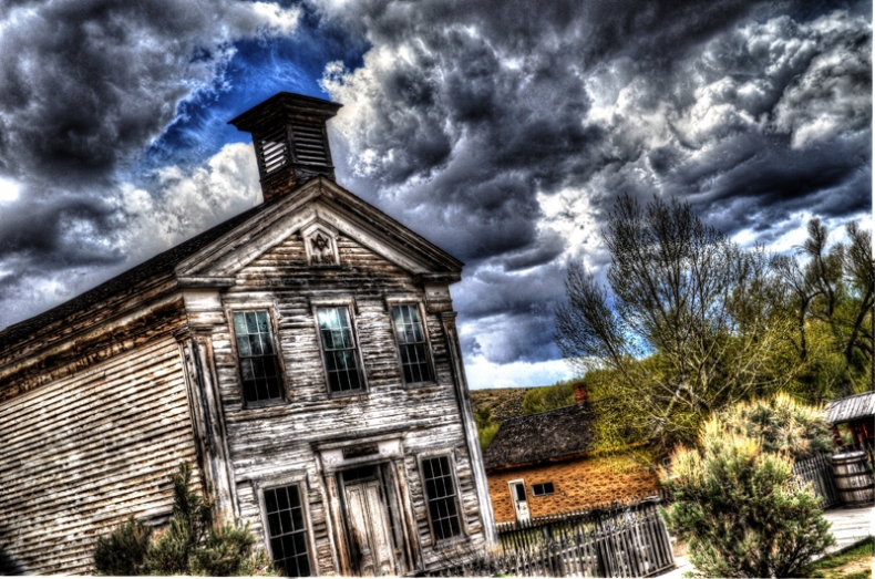
Church; 5/24/12, 1:45:18 PM; Bannack Ghost Town; f/11.0; 1/125; NIKON D5100

Image

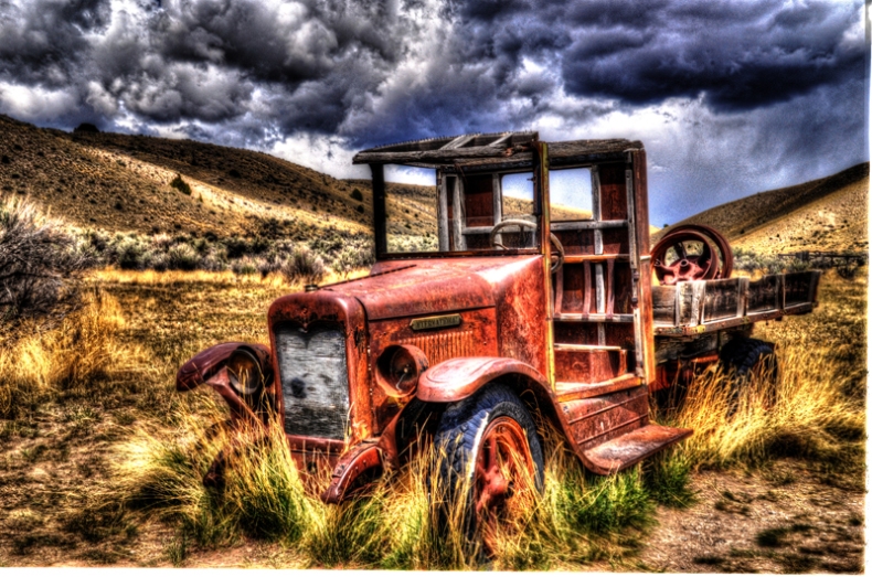
Truck; 5/24/12, 1:25:00 PM; Bannack Ghost Town; f/14.0; 1/200; NIKON D5100

Image

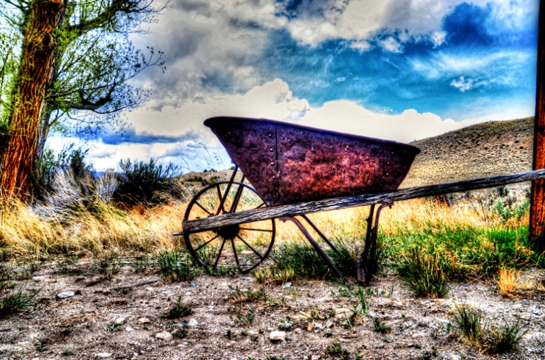
Wheelbarrow; 5/24/12, 1:25:00 PM; Bannack Ghost Town; f/11.0; 1/125; NIKON D5100


Flexible Edits:

Image

Tire Tracks; 5/5/12, 4:55:31 PM; Rexburg, Id; f/6.3; 1/250; NIKON D5100

Image

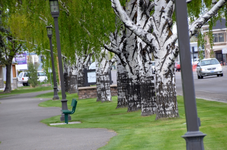
White Trees; 5/5/12, 5:05:39 PM; Rexburg, Id; f/11.0; 1/50; NIKON D5100


Camera Raw:

Image

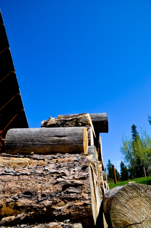
Logs; 5/12/12, 10:46:33 AM; Mesa Falls – Near Ashton, Id; f/20.0; 1/80; NIKON D5100

Image

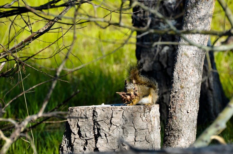
Squirrel; 5/12/12, 9:19:33 AM; Mesa Falls – Near Ashton, Id; f/11.0; 1/200; NIKON D5100


Added Type:

Image


Image

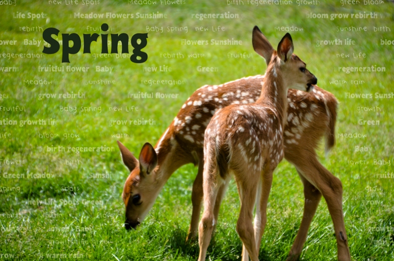
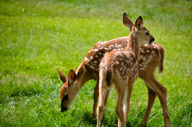
Spring Babies; 6/21/12, 3:12:57 PM; Rexburg, Id: f/6.3; 1/500; NIKON D5100


Fine Art Template:

Image

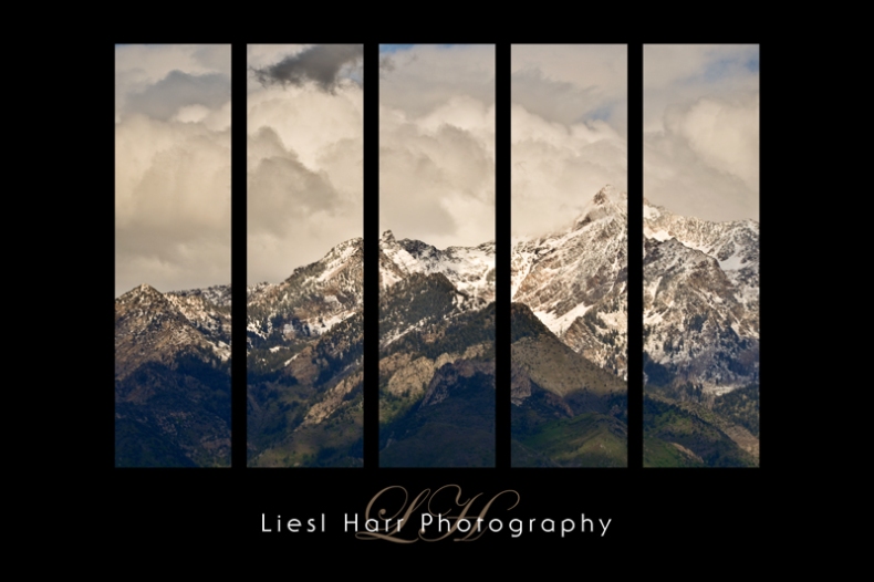
Mountain Picture: Mountains; 5/27/12, 5:00:07 PM; Salt Lake City, Ut: f/13.0; 1/250; NIKON D5100